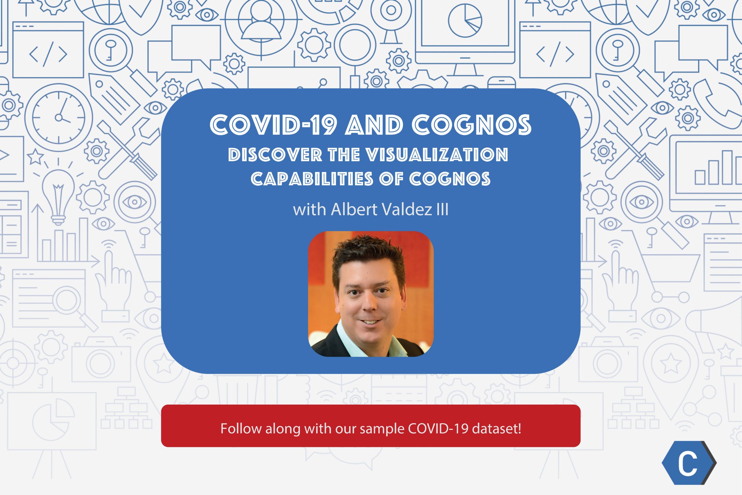
Follow along with Cognos expert Albert Valdez III as he creates a COVID-19 dashboard with ease, thanks to the powerful visualization capabilities of Cognos. Always focusing on the positives, Albert shows us rates of recovery around the world as he draws attention to Cognos features many are unaware of, including the ability to craft professional presentations that outmatch anything you could create with PowerPoint.
Download the data to follow along on your computer: https://bit.ly/2Km58Mv
Amanda Buckholt (00:00):
Hello everybody. This is Amanda from Cresco International and I hope you’re all staying safe and healthy as we battle through COVID-19. Many of you have indicated you’re using quarantine to polish your skills and that’s why we decided to bring Albert Valdez III on our show. Albert is the CEO of Intelalytics and a Cognos mastermind. Today he will be showing us some underutilized features of the platform and demonstrating how you can craft better presentations with Cognos. Joining us on the Cresco side is our VP of Services, Kenny Mobley, who’s going to go ahead and kick us off.
Kenny Mobley (00:34):
Thanks for being on with us today. I’m looking forward to this.
Albert Valdez III (00:39):
Yeah, thanks Kenny. And thanks Amanda. Glad to be here.
Kenny Mobley (00:43):
Hey Albert. Today I’d like to start looking at Cognos Analytics from a little bit different perspective and I know that you work with it so much. You probably have some good tips here, but what do you feel are some key features of Cognos Analytics that are under utilized?
Albert Valdez III (00:59):
Yeah, you know, that’s a really great question, Kenny, and I appreciate bringing this a little bit of a new perspective here. We know that the overall strengths of the platform are still its best-in-class enterprise reporting and automation capabilities. Fortunately, that has not changed and for those of us that spend a lot of time delivering these types of solutions, it is reassuring to see the continuing investment in these enhancements and the crucial component of report capabilities on the platform. We’ve even seen in the most recent Gartner report on business intelligence platforms, which historically has not been very kind to IBM Cognos at least in recent years, a renewed appreciation of the value and importance of good old report-offering capabilities. However, that’s not the whole story. I’m glad you asked this question because for the past four or five years, we’ve seen this platform evolve significantly to address gaps in its ability to deliver true self service analytics – most notably, the need for analysts to quickly be able to introduce new sources of data and manage their own data modeling has been very effectively addressed with the data upload feature, which is something I’m going to show here today and even more significantly with data modules, which really shifts the data modeling and metadata paradigm for the platform. I’d love to cover more of that feature in one of our upcoming sessions, but what I really wanted to focus on today are some of the more immediate benefits that can really extend the value of this platform.
Kenny Mobley (02:40):
Well that’s great Albert, I appreciate that. Those were some interesting features. What do you mean by the term “extending the value”?
Albert Valdez III (02:47):
Yeah, so again, you know, enterprise class reporting is a well known strength of Cognos and has been for decades, but I typically see organizations investing in multiple other tools when it comes to a more nimble, more kind of visually driven solution and for good reason there’s an entirely new audience with different needs, different personas and different expectations for how our BI tool should work for that and for many years that meant something other than Cognos. But what I want to show right now is that for those organizations that are either currently using Cognos Analytics, those that might be considering the platform or maybe running an older version like Cognos 10, you might be missing out on some of these killer benefits. I hate to see a lack of awareness result in a lack of adoption that leaves this value when tapped.
Kenny Mobley (03:30):
Well, that sounds great Albert. What are you going to show us today?
Kenny Mobley (03:34):
All right. Yeah, let’s get down to it. In the past few weeks we’ve all been inundated with numbers associated with the awful outbreak of COVID-19 and in today’s world, data is everywhere. In addition to the importance that we always preach about data literacy, it’s also important to know how to take full advantage of the tools that we have available that give us insights and the ability to deliver that data in meaningful ways. What I want to focus on today are the following key features. First, how easy it is to get data into CognosAanalytics. Secondly, ability to create visually appealing dashboards using very intuitive gestures – so something that pretty much any user can pick up pretty quickly. And finally, how to take those assets and create interactive presentations. And so maybe we can start to move away from those really text-heavy PowerPoint decks that require us to copy and paste the views of data into them and that are very static and let the data actually take the center stage and speak for itself. So, I’m going to jump right into it and I’m going to go ahead and share my screen.
Albert Valdez III (04:46):
There we go. So I’m just going to present my browser here and so I’ve got Cognos 11.5. So this is release 5. I think it’s one release behind the most current which just came out a week or so ago. It was not a real significant release, so I think 5 is a pretty good line in the sand to start with. I’ve downloaded a couple of datasets from some publicly available sites. The first was from data.world and this one’s kind of the bad news, right? These are the confirmed cases and deaths by day and so this is going to show it by region and by country. Then the second source is from that famous Johns Hopkins dashboard and all the data sets that go into that really nice looking dashboard are also publicly available.
Albert Valdez III (05:44):
I found some over on GitHub and there I’m going to show a little bit more of the good news, which is on the number of recovered cases by day. This first file is fairly large, so I’m going to drop it over here from my downloads onto my Cognos Analytics session. You can see it immediately prompts me for me “what do I want to do with the data” so I can do a simple “upload it” and I’ll do something with it later or I can “create a dashboard in exploration” or you also saw there that the upload or the ingestion process can be used to immediately create a data module.
Albert Valdez III (06:32):
Typically I would usually immediately take raw data and bring it into a data module. The reason for that is because I’m probably gonna have to do at least some sort of data cleansing and the data module gives me the ability to do that as well as enhance that data with calculations and filters and even things like navigation pals, which is really cool. Also a data module would give me an opportunity if I needed to at some point combine that source through a joint or relationship with other sources. So, I can actually do that kind of full end to end data modeling within the data module. So, that’s usually where I’d start. Also, one of the reasons why I wanted to show this today is recently I was sent a PowerPoint template for presenting this kind of data and it looked really nice.
Albert Valdez III (07:34):
The layout was great. It had some dummy data in there and I was like, this would be really cool, but how would I get my data into the PowerPoint template? Right? I had to go somewhere else to grab the visualizations and then move them into PowerPoint. That’s a process that I think is really too manual. It’s too time consuming. So I’ve got a dashboard template here in Cognos that looks a little bit like the template that I was shown in PowerPoint and here’s my uploaded file and here are all of the elements of that. So I’ve got my country, region, province, state. The first thing I wanted to focus on here is show kind of the bad news and focus in on the U S since we’re kind of going through the peak here right now.
Albert Valdez III (08:17):
So I’m going to drag my province/state. You can see that that ingestion process-it’s analyzed my measures and it’s analyzed my geo and my time series here. So I’m going to drag this and drop it right in the center of my main cell here and just it’s going to render a map. Again, this is all countries right now. I haven’t put a measure on here yet, so I’m going to go ahead and drag my cases, measure onto this and it’s going to sum up all the cases. And again, I wanted to focus this first view here on the U S so I’m actually going to take my countries and I’ve got a couple of drops zones here for filtering. I’m to filter just this one tab by the U.S. so again, pretty intuitive gestures. There’s not really a lot of technical skills required to get here.
Albert Valdez III (09:07):
I can filter by country pretty easily, so here I’m going to zoom in on the U.S. I may want to customize this map a little bit, so I have some properties I can deal with here. For instance, I don’t necessarily need to show this legend. It takes up a lot of space. This is my bad news display so I want to go ahead and change my heat palette to this red shades here and I can go ahead and hide the properties now. I do have the different case types. Again, this source just shows the confirmed and then the deaths broken out. So I’m going to drop that onto this part of my dashboard. And again, just drag and drop the data. It’s got my two different case types. I’m actually going to show this with the measure on here as well.
Albert Valdez III (09:57):
This will drop the number into this column here and I’m going to clean this up a little bit. Actually what I’m going to do is take up a little bit more space and then change the way this is presented. So it interpreted the data and it used this tabular format. I want to do something more graphical and create a column layout or a visualization here. Then the the last thing I wanted to do here is show how these numbers are changing over time. So I have my date column and I opened it up. I could see the data goes all the way back to January 22nd which for the U.S. Didn’t have a lot of activity then. So I’m going to actually filter this down, which again I can do pretty easily. Hit the little action button there.
Albert Valdez III (10:45):
I get this calendar dropdown so I don’t even have to do any typing and I can drop in and say let’s just start, for instance, maybe around March 20th and the data goes up through yesterday. And so I’ll go ahead and grab just those dates and now I want to present those dates so that I can interact with the timeline up on the dashboard. I’m going to stretch this out and again, it gives me kind of this list layout, which I don’t like. I know Cognos has a really cool visualization called a data player and it’s not something I like to overuse. But when you’re looking at things and how they change over time, like I’m going to do here, I think the data player can be pretty effective. So, you know, I’ve dropped a few things onto the screen here.
Albert Valdez III (11:35):
I’ve dropped, you know, uploaded the data. I’ve got my filter. Let me go ahead and pull this into the full screen just to see what we have so far. As you might imagine, I can hit the player. I’m going to shrink this down and set the data into motion and you can see it kind of cycles through and you’ll see the numbers going up at any point in time. I can pause, I can use the playoffs. Other reason why I like the players, its orientation, not just because I like to see things moving automatically. I’ll usually keep this paused and then just use this as a way to do filtering on a more kind of a horizontal type of a table versus the more vertical table that I had before. So this is a good start. It’s not, again, the numbers that we like to see, but we’re going to go ahead and contrast that with our recovered data on the next tab.
Albert Valdez III (12:25):
So I’m going to rename this one real quick. So I have a tab. This is going to be U.S. Cases by State, and then I’m going to add my other data into a second tab. I don’t want to overcrowd dashboarding. Sometimes I see we think this dashboard has got to have everything on it, so we see a lot of crowded data. I can still have a single dashboard, but leveraging tabs is a really effective way to include additional pieces of data anddifferent insights without overcrowding anyone’s view of the information. So I’m going to use the same template just to keep it simple and I want to bring in some new data here. I have another data source that I’ve uploaded.
Albert Valdez III (13:13):
So let’s go back to the homepage. This source is really tiny. Let’s just drop it into my content. It’s only like 53K, so this one’s set up a little bit differently too. So now that I’ve uploaded this, I can get back to my dashboard and I can bring that source in through my content, which is there now. Another great feature of dashboarding is it doesn’t care how many sources you use. Obviously I don’t have a join between these right now. I could have done a data model through data modules but right now I’m going to keep them kind of separate. So, these are my recovered cases. And again, this is by day, but this one has a date column, a column for each date, I should say, all the way up again through yesterday, with today being the 9th.
Albert Valdez III (14:06):
So I’ve got to think about how I want to use this data a little bit differently, although I can still get kind of a similar result. So what I’m going to do here is I want to show the world wide recoveries. So I’m going to drag my countries this time onto my big drop zone here and you can see each measure is per day. So I’m going to grab my latest date and drop that onto the map. And same kind of thing I did with the map on the other tab is I want to get rid of my legend. The measure is pretty self explanatory and let’s change the palette. This one we have a green heat, which again is because these are the good news. So the recovery is going up is a good thing. And let’s see, I also want to show the recovery trend
Albert Valdez III (15:05):
and one way to do that with this type of data is to pick a starting point. Although this goes back to January, we probably don’t see a lot of recovery starting until really February orMarch so I’m going to actually start with March. The way I’m going to use this columnar structure here is I’m going to grab each date, measure and drop them in to my viz one at a time. In fact, I’m going to grab them all as a group. I’m just going to go kind of every 10 days here, so starting on March 1st we’ll grab the 10th, the 20th, and the 30th and then we’ll grab maybe a couple or two or three dates here in April. So let’s go with the 2nd and the 5th. So I’ve got a bunch of measures in my selection and I’m going to just drop them on these seven values onto the screen.
Albert Valdez III (15:56):
It’s going to visualize them. I get the bar chart. I’m going to stretch this out. And you know, maybe now that I’ve got a little bit more horizontal space, I’ll go to a column presentation so I can see the numbers going up, which are good news. This is how many recovered cases there are in each of these days. I’ve got a few other spots where I can maybe drop this kind of data. Maybe I’ll just again go back to like 1st of March and I’ll say what was the total number of recovered cases on 1st of March? And then maybe let’s go with the 1st of April and see what that looked like there. I get these little summary visualizations that would show me the date and the total and then let’s grab the latest date here and drop that up and say we can see the numbers going up.
Albert Valdez III (16:43):
Obviously we see the same thing here in the column display, but again the data is interactive. So if I want to,for instance, focus in on China, it automatically updates my other visualizations. Another simple click here releases the filter to show overall for all countries and I can zoom in and pan around in the map, keep it a little bit more tight in the view here. I’m going to give my tab a name. This will be Worldwide Recovered by Country and now I’ve got a dashboard in just a couple of minutes from the two data sources. The visuals look nice. It’s a very simple drag and drop building of the dashboard process.
Albert Valdez III (17:38):
What can we do with this now? I want to take this data and again, I want to get to where I was as far as presentation and delivery and creating a story here in Cognos Analytics is something that, this is where I really typically don’t see a lot of familiarity and again, just because we don’t get a lot of education on this and that’s one of the things that we really try to preach. So when I create a story from the dashboard, I can do a slide show, which is kind of similar to what we’re used to with like PowerPoint presentation deck. Guided journeys are also really powerful. They’re a little bit more sophisticated, take a little bit more planning in my mind. Um, so I’m not going to jump into that here. I’m just going to do the slide show and show you what we get.
Albert Valdez III (18:18):
So I’ve got to save it out. I’ll just drop it into my folder here and I’ve got a new dashboard. I’ve started a new story called New Dashboard just cause I didn’t change the name on it. All right, so what is the story all about? So here the story is a collection of what we call scenes. So my dashboard became these two scenes that you see. Down here in my little scene sorter and I can add scenes. I can add, for instance, a title scene with some text. I can add text and visualizations. I can add a blank scene where I can drop in media, like videos or anything else from the web. You can drop in websites into the scene images. I’m going to stick with just my two elements from my dashboard. What I want to do here is zoom in on each of these different scenes within what’s called the timeline.
Albert Valdez III (19:14):
This is where things get kind of fun. My scene is made up of my map, my column chart and my little data player here. Each element will start at zero seconds and play for five seconds. Now you can extend out, like for instance, maybe I want this scene to last 15 seconds and maybe I don’t want my column chart to show up until the five seconds and maybe I want it to fade out after 12. Maybe I want my dates to come in at two and stay for the entire duration of the scene. So this is how I can kind of animate the content within the dashboard. So as I move it into the story, I create this narration, right? And even within each of these elements you can also add what are called highlights, which I think are kind of fun.
Albert Valdez III (20:04):
So maybe here at the seven second mark, I want to the dashboard to highlight California in the map. So I’m going to say highlight California and maybe at 10 seconds I highlight a different state or whatever. I could also create animation. So for instance, here, if I want to bring in my animation properties, the properties panel, since I have it starting and ending at different points in time, I have the ability to do entrance and exit animation. Again, very similar if you’ve ever done animated slide show in PowerPoint, right? So I’m not going to get into that right now. I just want to show you what this looks like if I do kick this thing off. So I did a little bit of staggering of the elements in the first scene. The next scene, I’m just gonna leave everything as is and I’m going to set up my story, when I kick it off to play all the scenes and to play in a loop.
Albert Valdez III (21:02):
So what happens now is if I go back to scene one and I go into full screen mode, I can now kick this thing off and do my narration as the data’s kind of being set into motion, right? So I have it set on whatever I clicked on last year. So this is as of April 6th, and then at any point in time, I can pause, move back in the timeline. For instance, if I want to see my column chart and then if I want to, I can use the data player. So the scene is paused, but I have the data player going through and showing how the cases are growing over time. You can see I have my highlight on California and then as I’m done with that, I can go to the next scene. Again, it’s going to go through five second duration until I pause it.
Albert Valdez III (21:54):
Again I can start telling my story here and zoom in and say let’s zoom into Europe and let’s see what the numbers look like. For instance, for France. You can see it immediately filters and you can see they have a little bit of a later start. So in the beginning of March, not many recoveries, but those numbers are growing. As of yesterday, that was how many recovered cases they reported. Of course I can release back out and say, here it is worldwide, go in and focus in on any of the other countries where there’s data. This allows me to stay right here within the BI tool, have the data be presented in a very visually appealing way, and not have to copy and paste it into another tool. Then when someone asks a question, I say, well, let’s go somewhere else to go get the most current data. Right . So, that’s what I wanted to show here today and hopefully it is something you can take away. If you’re interested in learning more about stories and dashboarding and how to use Cognos Analytics to kind of move into this new world of more modern BI, then we’re here to help.
Kenny Mobley (23:01):
That’s great Albert, I really appreciate that. The scenes to me is so compelling to be able to take that somewhere, tell a story and be able to stop and look at something else because that’s usually what happens when you’re telling a data story- there’s other questions and other things. I think that is a great feature that a lot of people could get a lot of value out of, so I appreciate you going through that part as well today.
Albert Valdez III (23:25):
Yeah, absolutely. You’re welcome. I love showing things that again, I think sometimes get overlooked. Again, it was really about maybe extending the value that you have with the tools that you’ve already have invested in.
Amanda Buckholt (23:41):
Thank you so much, Albert. You really taught us a lot today. However, as with most things, we know that there is a whole lot more we can still learn. If one is interested in learning more on this topic, where should they turn to next?
Albert Valdez III (23:55):
Yeah, thanks for that Amanda. I do believe that education is really the key to extending value and building insights and really taking things to the next level. So www.intelalytics.com or follow me, Albert Valdez, on LinkedIn. You know, I’m there for you. I build tailored training solutions for clients using these tools all the time. I think the best way to learn is in the context of your environment, so building something that’s tailored and customized for your particular needs and your particular audiences is what we do. I’d love to get you guys to reach out to me directly or on www.intelalytics.com
Amanda Buckholt (24:36):
Alright, awesome. Well, thank you so much for taking the time to be here with us today. I know we all learned a lot and we had a really good time discussing Cognos with you. Thank you to our viewers for tuning in. Please be sure to follow us on LinkedIn under Cresco International and on Twitter @Cresco_Intl to stay up to date on future podcasts and shows.

