The spread of the Covid-19 pandemic has been a global health crisis. Efforts to mitigate the impact on people are now the top priority of governments across the world. As they make these life-saving decisions, it is particularly crucial for policymakers to accurately predict how the spread of the virus will change over time. Thanks to a team at Johns Hopkins University, the data of Covid-19 becomes available to the public.
What can us as civilians do to lower the risk of Covid-19? Data science helps tell a story behind numbers so that we may find a better way out. In this article, I will perform some basic analyses focused on data of the contiguous United States.
Let’s take a glance at the data, as of Apr. 28th, total confirmed cases over 1,000,000! Then New York 30,000, New Jersey 11,000, Massachusetts 58,000… Well, this is not good. and I made a plot to see how these numbers have changed over time.
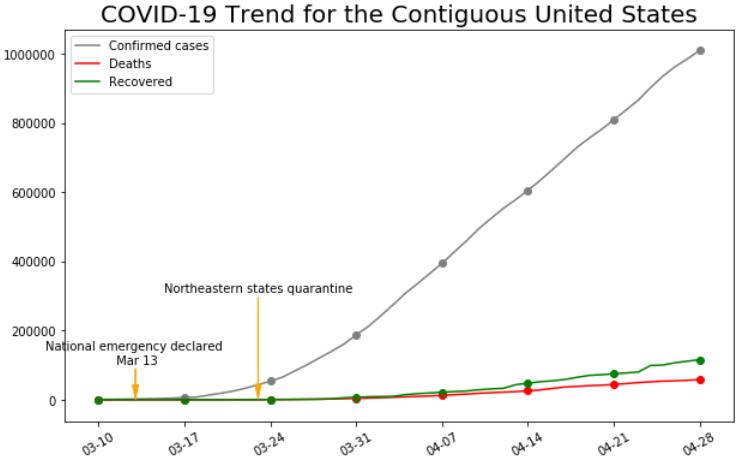
This Covid-19 has a latency around 2 weeks, in other words, symptoms don’t appear until two weeks after contraction of the virus. We notice the first arrow in Fig. 1, this is when a national emergency was declared, showing that the government started to take Covid-19 seriously. Before that, the World Health Organization (WHO) had already released warnings across the globe. However, it was mis-interpreted as just a flu and still considered unimportant even though the death rate in Spain and Italy reached 10%. The number of confirmed cases rose exponentially. Then each state started to realize the seriousness of the situation, and luckily, actions were taken timely.
The numbers of the three northeastern states contribute to over 1/3 of the total number of coronavirus cases. Why? We need to look at the population density first:
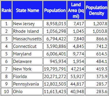
An airborne virus is more likely to spread if the number of people in contact is higher. From the table above, eight out of ten densely populated states are in the northeast part of America, not to mention three metropolitan areas, New York City, Boston and Philadelphia. No wonder why NY, NJ and MA have so many people infected.
Most northeastern states issued stay-home orders around Mar. 20th, and we can clearly see the effects of the orders in early April. The increase of confirmed cases becomes linear instead of exponential – it’s greatly slowed! But don’t feel relieved yet, this is not the whole story. Although the rate of increase was slowed, the medical system has been overloaded since the first few weeks of explosion. Fig. 2 shows the fatality rate of several states with top numbers of confirmed cases, showing this virus is much more fatal than the flu.
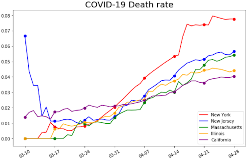
Except for New Jersey, which wasn’t prepared at first, the death rate increased over time from early March. This indicates that the medical system is overloaded and many patients cannot be treated properly. As you may know, California is one of the first few states to take actions, so the death rate hasn’t increased that much. The good news is that we see the curve flattening as we learn more about Covid-19 and doctors have developed effective therapies for patients. This is also reflected in the recovery rate shown below.
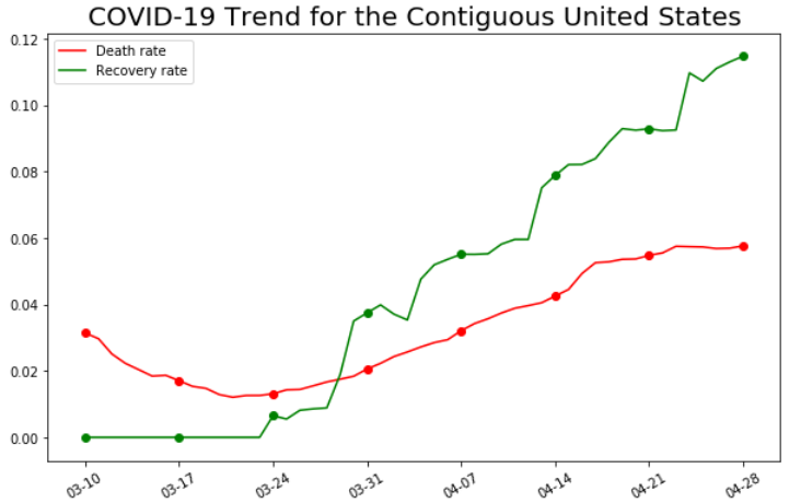
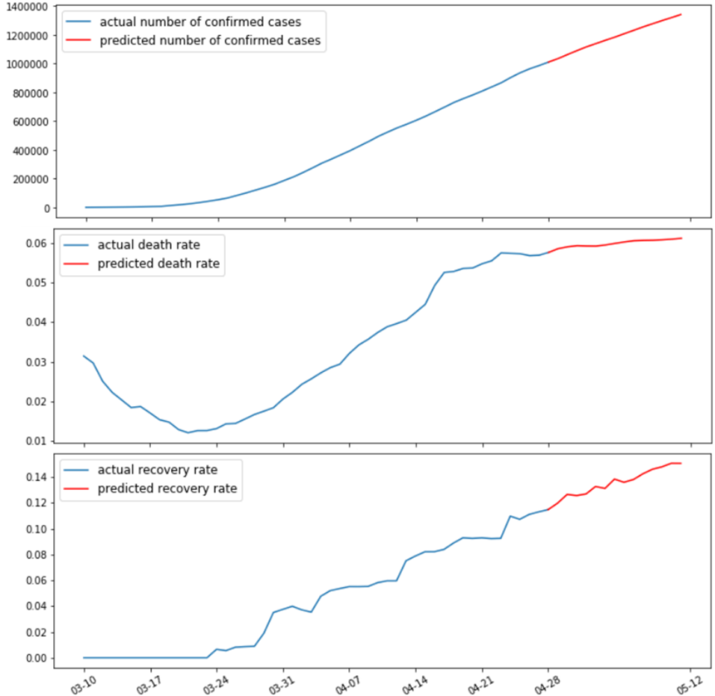
Here I present my naïve predictions for the next two weeks with the help of machine learning techniques, if the situation is relatively unchanged.
The stay-home orders are about to expire soon for many states, and everyone wants to resume normal life. Is this a good idea? Let’s take a look at other countries to see what we can learn.
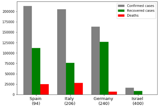
The number below a country name is the average number of people per km2. Obviously, Israel did the best job and then Germany with higher population density. Rapid actions and cooperation of their people are what keep numbers low, including traffic/travelling control, preparation of medical equipment, and people staying at home. While people in Spain and Italy are protesting on streets against the “lockdown”.
For the contiguous United States, the stay-home orders have been effective for over a month. Although a portion of people still need to work for essential food and med-care, the situation is rather stable for now. Moreover, with sufficient medical supply and growing knowledge of the virus, the pressure of the medical system will be relieved in the future. As a result, the number of confirmed cases will still grow linearly, the death rate will go flat, even start to drop, and the recovery rate will rise up to a certain level in the near future. The best way to win the fight against Covid-19 is to STAY home.
To summarize, as suggested by data science, we should still stay at home and avoid contact with people as much as possible. If you must go outside, remember to wear a mask and gloves. It’s a protection for you and other people. Hope everyone stays happy and healthy!
Data Source:
https://github.com/CSSEGISandData/COVID-19/tree/master/csse_covid_19_data


